It is tempting to forge ahead with ambitious plans for Web interfaces that grab the attention, that look impressive and do new and whizzy things. But I largely agree with Lloyd Rutledge that we want “less emphasis on grand new interfaces” (Lloyd Rutledge, The Semantic Web – ISWC 2010, Selected Papers). I think it is important to experiment with exciting, innovative interfaces, but the priority needs to be creating interfaces that are effective for users, and that usually means a level of familiarity and supporting the idea that “users of the Web feel it acts they way they always knew it should (even though they actually couldn’t imagine it beforehand).” Maybe the key is to make new things feel familiar, so that we aren’t asking users to learn a whole new literacy, but a new literacy will gradually emerge and evolve.
For the Archives Hub, we face similar challenges to many websites that promote and provide access to archives, although our challenges are compounded by being an aggregator and not being in control of the content of the descriptions. We are seeking to gradually modify and improve our interfaces, in the hope that we help to make the users’ discovery experiences more effective, and encourage people to engage with archives.
One of our aims is to introduce options for users that allow them to navigate around in a fairly flexible manner, meeting different levels of experience and need, but without cluttering the screen or making the navigation look complicated and off-putting. Interviews with researchers have indicated how people have a tendency to ‘click and see’, learning as they go, but expecting useful results fairly quickly, so we want to work with this principle, to use hyperlinks effectively, on the understanding that the terminology used and the general layout of the page will have an effect on user expectations.
A Separation of Parts
One of the issues when presenting an archival description is how to separate out the ‘further actions’ or ‘find out more’ from the basic content. The challenge here is compounded by the fact that researchers often believe the description is the actual content, and not just metadata, or alternatively they assume that they can always access a digital resource.
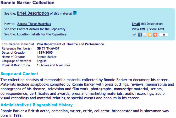
We have tried to simplify the display by introducing a Utility Bar. It is intended to bring together the further options available to the end user. The idea is to make the presentation neater, show the additional options more clearly, and also keep the main description clear and self-contained.
The user can click to find out how to access the materials, to find out where the repository is located in the UK or contact the repository by email. We are planning to make the email contact link more direct, opening an email and populating it with the email address of the repository in order to cut down on the number of stages the user has to go through (currently we link to the Archon directory of Archive services). We can also modify other aspects of the Utility Bar over time, adding functionality as required, so it is a way to make the display more extensible.
We have included links to social networking sites, although in truth we have no real evidence that these are required or used. This really was a case of ‘suck it and see’ and it will be interesting to investigate whether this functionality really is of value. We certainly have a lively following on Twitter, and indications are that our Twitter presence is valued, so we do believe that social networking sites play an important part in what we do.
We have also included the ability to view different formats. This will not be of value to most researchers, but it is intended to be part of our mission to open up the data and give a sense of transparency – anyone can see the encoding behind the description and see that it is freely available. Some of our contributors may find it useful, as well as developers interested in the XML behind the scenes.
The Biggest Challenge: how to present an archive description
Until recently we presented users with an initial hit list of results, which enabled them to see the title of a description and choose between a ‘summary’ presentation and a ‘full’ presentation. However, feedback indicates that users don’t know what we mean by this. Firstly, they haven’t yet seen the description, so there is nothing on which to base the choice of link to click, and secondly, what is the definition of ‘summary’ and ‘full’ anyway? Our intention was to give the user the choice of a fairly brief, one page summary description, with the key descriptive data about the archive collection, or the full, complete description, which may run to many pages. A further consideration was that we could only provide highlighting of terms on a single page, so if we only had the full description, highlighting would not be possible.
There are a number of issues here. (a) Descriptions may be exactly the same for summary and full because sometimes they are short, only including key fields, and they do not provide multi-level content; the full description will only provide more information if the cataloguer has filled in additional fields, or created a multi-level display. (b) ‘Summary’ usually means a cut-down version of something, taking key elements, but we do not do this; we simply select what we believe to be the key fields. For example, Scope and Content may actually be very long and detailed, but it would always be part of the ‘summary’ description. (c) Fields that are excluded from the summary view may be particularly important in some cases – for example, the collection may be closed for a period of time, and this would really be key information for a researcher.
With the new Utility Bar we changed ‘summary’ and ‘full’ to become ‘brief’ and ‘detailed’. We felt that this more accurately reflects what these options represent. At present we have continued with the same principle of displaying selected fields in the ‘brief’ description, but we feel that this approach should be revised. After much discussion, we have (almost) decided that we will change our approach here. The brief description will become simply the collection-level description in its entirety; the detailed description will be the multi-level description. This gives the advantage of a certain level of consistency, but there are still potential pitfalls. Two of the key issues are (a) that ‘brief’ may actually be quite long (a collection description can still be very long) and (b) that many descriptions are not multi-level, so there would be no difference between the two descriptions. Therefore, we will look at creating a scenario where the user only gets the ‘Detailed Description’ link when the description is multi-level. If we can do this we will may change the terminology; but in the end there is no real user-friendly way to succinctly describe a collection-level as opposed to a multi-level description, simply because many people are not aware of what archival hierarchy really means.
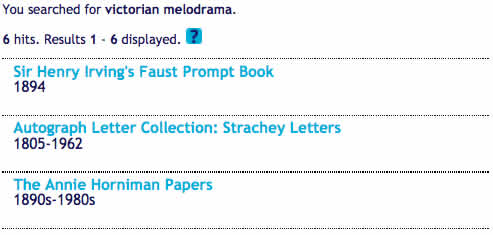
 As well as introducing the Utility Bar we changed the hit list of results to link the title of the description to the brief view. We simply show the title and the date(s) of the archive, as we feel that these are the key pieces of information that the researcher needs in order to select relevant collections to view.
Centralised Innovation
For some of the more complex changes we want to make, we need to first of all centralise the Archives Hub, so that the descriptions are all held by us. For some time we thought that this seemed like a retrograde step: to move from a federated system to a centralised system. But a federated system adds a whole layer of complexity because not only do you not have control over the data you are presenting; you do not have control over some of the data at all, to view it, and examine any issues with it, and also to potentially improve the consistency (of the markup in particular). In addition, there is a dependency between the centralised system and the local systems that form the federated model. Centralising the data will actually allow us to make it more openly available as well, and to continue to innovate more easily.
Multiple Gateways: Multiple Interfaces
We will continue to work to improve the Archives Hub interface and navigation, but we are well aware that increasingly people use alternative interfaces, or search techniques. As Lorcan Dempsey states: “options have multiplied and the breadth of interest of the local gateway is diminished: it provides access only to a part of what I am potentially interested in.” We need to be thinking more broadly: “The challenge is not now only to improve local systems, it is to make library resources discoverable in other venues and systems, in the places where their users are having their discovery experiences.” (Lorcan Dempsey’s Webblog). This is partly why we believe that we need to concentrate on presenting the descriptions themselves more effectively – users increasingly come directly to descriptions from search engines like Google, rather than coming to the Archives Hub homepage and entering a search from there. We need to think about any page within our site as a landing page, and how best to help users from there, to discovery more about what we have to offer them.

