As part of the Archives Hub Labs ‘Images and Machine Learning’ project we are currently exploring the challenges around implementing IIIF image services for archival collections, and also for Archives Hub more specifically as an aggregator of archival descriptions. This work is motivated by our desire to encourage the inclusion of more digital content on Archives Hub, and to improve our users’ experience of that content, in terms of both display and associated functionality.
Before we start to report on our progress with IIIF, we thought it would be useful to capture some of our current ideas and objectives with regards to the presentation of digital content on Archives Hub. This will help us to assess at later stages of the project how well IIIF supports those objectives, since it can be easy to get caught up in the excitement of experimenting with new technologies and lose sight of one’s starting point. It will also help our audience to understand how we’re aiming to develop the Hub, and how the Labs project supports those aims.
Why more digital content?
- We know it’s what our users want
- Crucial part of modern research and engagement with collections, especially after the pandemic
- Another route into archives for researchers
- Contributes to making archives more accessible
- Will enable us to create new experiences and entry points within Archives Hub
- To support contributing archives which can’t host or display content themselves
The Current Situation
At the moment our contributors can include digital content in their descriptions on Archives Hub. They add links to their descriptions prior to publication, and they can do this at any level, e.g. ‘item’ level for images of individually catalogued objects, or maybe ‘fonds’ or ‘collection’ level for a selection of sample images. If the links are to image files, these are displayed on the Hub as part of the description. If the links are to video or audio files, or documents, we just display a link.
There are a few disadvantages to this set up: it can be a labour-intensive process adding individual links to descriptions; links often go dead because content is moved, leading to disappointment for researchers; and it means contributing archives need to be able to host content themselves, which isn’t always possible.
Where images are included in descriptions, these are embedded in the page as part of the description itself. If there are multiple images they are arranged to best fit the size of the screen, which means their order isn’t preserved.
If a user clicks on an image it is opened in a pop out viewer, which has a zoom button, and arrows for browsing if there is more than one image.
The embedded image and the viewer are both quite small, so there is also a button to view the image in fullscreen.
The viewer and the fullscreen option both obscure all or part of the decription itself, and there is no descriptive information included around the image other than a caption, if one has been provided.
As you can see the current interface is functional, but not ideal. Listed below are some of the key things we would like to look at and improve going forwards. The list is not intended to be exhaustive, but even so it’s pretty long, and we’re aware that we might not be able to fix everything, and certainly not in one go.
Documenting our aims though is an important part of steering our innovations work, even if those aims end up evolving as part of the exploration process.
Display and Viewing Experience
❐ The viewer needs updating so that users can play audio and video files in situ on the Hub, just as they can view images at the moment. It would be great if they could also read documents (PDF, Word etc).
❐ Large or high-resolution image files should load more quickly into the viewer.
❐ The viewer should also include tools for interacting with content, e.g. for images: zoom, rotate, greyscale, adjust brightness/contrast etc; for audio-visual files: play, pause, rewind, modify speed etc.
❐ When opened, any content viewer should expand to a more usable size than the current one.
❐ Should the viewer also support the display of descriptive information around the content, so that if the archive description itself is obscured, the user still has context for what they’re looking at? Any viewer should definitely clearly display rights and licensing information alongside content.
Search and Navigation
❐ The Archives Hub search interface should offer users the option to filter by the type of digital content included in their search results (e.g. image, video, PDF etc).
❐ The search interface should also highlight the presence of digital content in search results more prominently, and maybe even include a preview?
❐ When viewing the top level of a multi-level description, users should be able to identify easily which levels include digital content.
❐ Users should also be able to jump to the digital content within a multi-level description quickly – possibly being able to browse through the digital content separately from the description itself?
❐ Users should be able to begin with digital content as a route into the material on Archives Hub, rather than only being able to search the text descriptions as their starting point.
Contributor Experience
❐ Perhaps Archives Hub should offer some form of hosting service, to support archives, improve availability of digital content on the Hub, and allow for the development of workflows around managing content?
❐ Ideally, we would also develop a user-friendly method for linking content to descriptions, to make publishing and updating digital content easy and time-efficient.
❐ Any workflows or interfaces for managing digital content should be straightforward and accessible for non-technical staff.
❐ The service could give contributors access to innovative but sustainable tools, which drive engagement by highlighting their collections.
❐ If possible, any resources created should be re-usable within an archive’s own sites or resources – making the most of both the material and the time invested.
Future Possibilities
❐ We could look at offering options for contributors to curate content in creative and inventive ways which aren’t tied to cataloguing alone, and which offer alternative ways of experiencing archival material for users.
❐ It would be exciting for users to be able to ‘collect’, customise or interact with content in more direct ways. Some examples might include:
- Creating their own collections of content
- Creating annotations or notes
- Publicly tagging or commenting on content
❐ Develop the experience for users with things like: automated tagging of images for better search; providing searchable OCR scanned text for text within images; using the tagging or classification of content to provide links to information and resources elsewhere.
Image credits
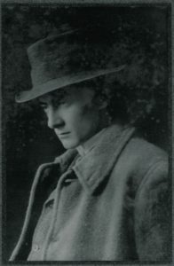
Edward Thomas: Papers of Edward Thomas (GB 1239 424/8/1/1/10), Cardiff University Archives / Prifysgol Caerdydd.
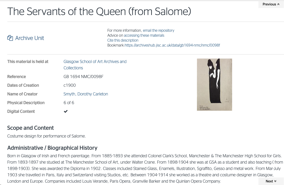
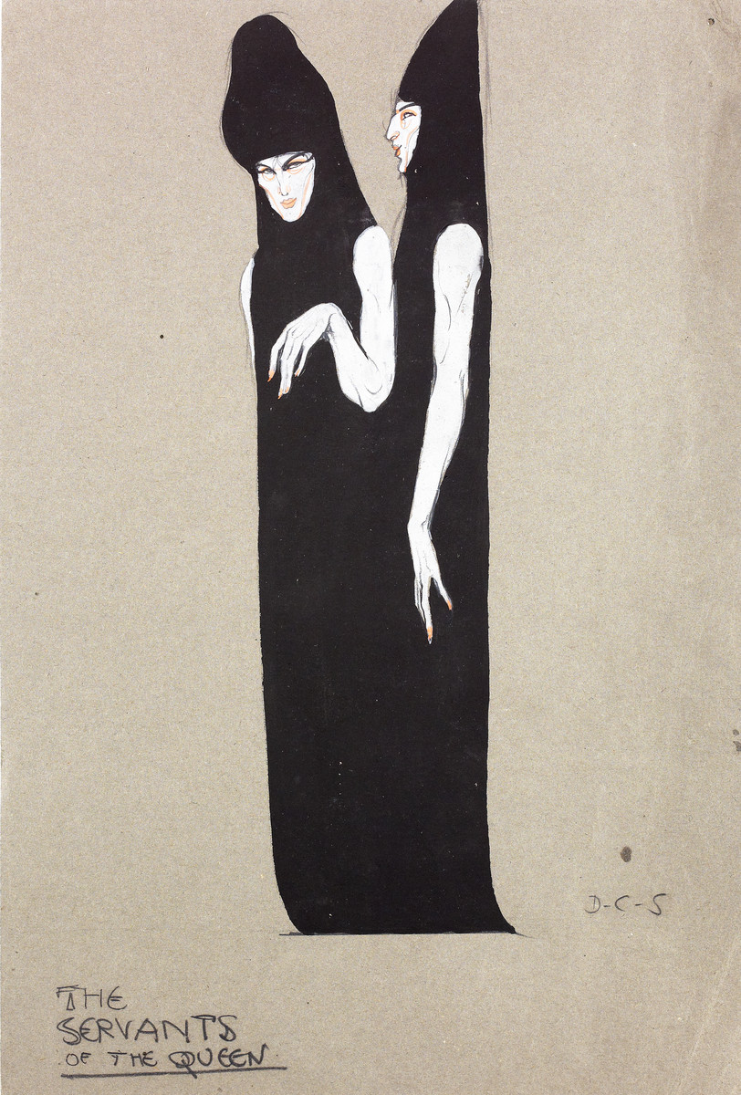
Servants of the Queen (from Salome, c1900): by Dorothy Carleton Smyth. Art, Design and Architecture collection (GB 1694 NMC/0098F), Glasgow School of Art Archives and Collections.
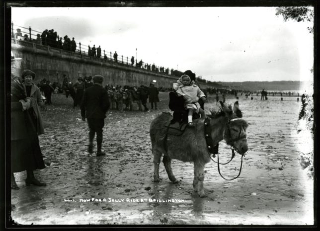
‘Now for a jolly ride at Bridlington’: Claude William Jamson Archive (GB 50 U DX336/8/1), Hull University Archives.
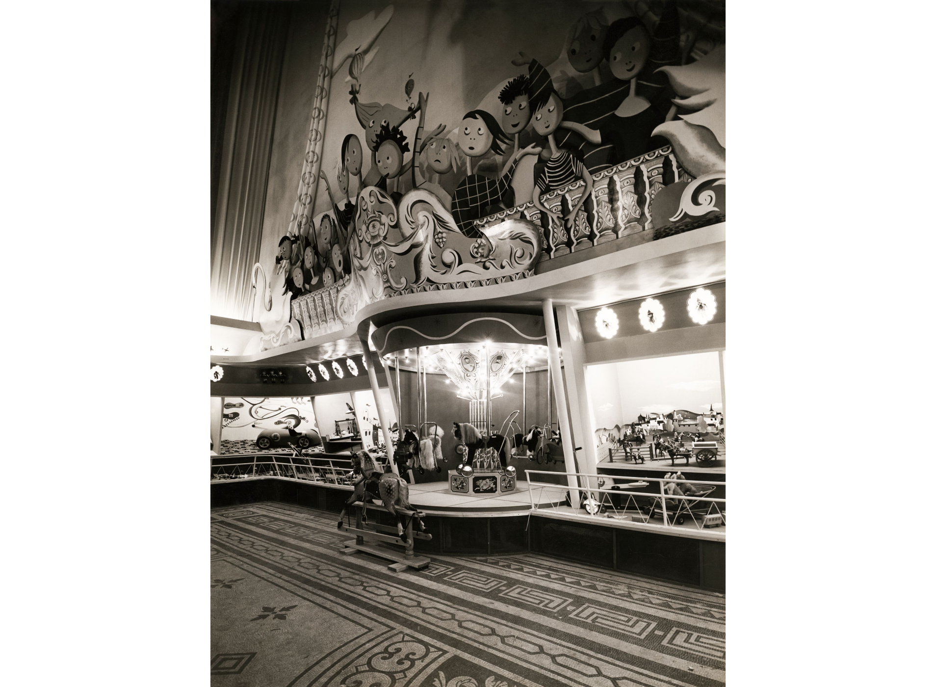
‘Things for children’: Design Council Archives (GB 1837 DES/DCA/30/1/13/25), University of Brighton Design Archives.

