Names (7): Into the Unknown

On the Archives Hub we have plenty of name entries without dates. Here is an example of the name string ‘Elizabeth Roberts’ (picked entirely randomly) from several different contributors:

Richard and Elizabeth Roberts
Roberts, Elizabeth fl. 1931
Elizabeth Grace Roberts
Roberts, Elizabeth Grace
Elizabeth Roberts
Roberts, Elizabeth
ROBERTS, Elizabeth Grace
ROBERTS, Mrs Elizabeth Grace

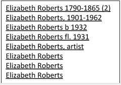
The challenge we have is how to work this names like this. Let me modify this list into an imaginary but nonetheless realistic list of names that we might have on the Hub, just to provide a useful example (apologies to any Elizabeth Roberts’ out there):

Elizabeth Roberts 1790-1865
Elizabeth Roberts, 1901-1962
Elizabeth Roberts b 1932
Elizabeth Roberts fl. 1958
Elizabeth Roberts, artist
Elizabeth Roberts
Elizabeth Roberts
Elizabeth Roberts

How should we treat these names in the Archives Hub display? If we can make decisions about that, it may influence how we process the names.

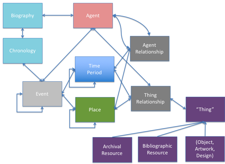
These names can be separated into two types (1) name strings that identify a person (2) name strings that don’t identify a person. This is a fundamental difference. It effectively creates two different things. One is an identifier for a person; one is simply a string that we can say is a name, but nothing more.

If we put two descriptions together because they are both a match to Elizabeth Roberts, 1790-1865, then we are stating that we think this is the same person, so the researcher can easily see collections and other information about them. 

If we put two descriptions together that are both related to Elizabeth Roberts we are not doing the same thing.  We are simply matching two strings. 

Which of these names is an identifier? That depends upon levels of confidence, and that is why being able to set and modify levels of confidence is crucial.

Elizabeth Roberts 1790-1865 – this is enough to identify a person.  In theory, there could be two people with the same life dates, but the chances are very low. So, we would bring together two entries and represented them on one name page.

Elizabeth Roberts b 1932 – Is a birth or death date enough? It allows for some measure of certainty with identity, and we would probably deem this to be enough to identify a person and match to another Elizabeth Roberts born in 1932, but it is not certain. If this Elizabeth Roberts was the creator, and she has several mentions of ‘art’, ‘artist’ and ‘painting’ in her biography, it is more likely that she is the same as Elizabeth Roberts, artist and might be useful to create a link, but would it be enough for a match?

Elizabeth Roberts fl 1931 – whilst a floruit date helps place the person in a time period, it is not enough to confidently identify a person.  

Elizabeth Roberts, artist – occupation or other epithet enough is not usually enough to identify someone.   If there is a biographical history, there is more information about the person, but this is not enough to be sure. 

If we had an entry such as Elizabeth Roberts, Baroness Wood of Foxley (completely imaginary and just for the purposes of example), then the epithet is more helpful. We might decide that this identifies a person enough for a match with any other instances of Elizabeth Roberts with baroness wood and foxley in the name string.

If we had MacAlister, Sir Donald, 1st Baronet, physician and medical administrator then ‘1st baronet’ alongside the name should give enough confidence for a match with another entry for 1st Baronet.

Display behaviour

So, how might we reflect this in the display? It can be useful to think about the display and researcher requirements and expectations and work back from there to how we actually process the data.

Firstly we might group two entries if they have the same date.

But this does not offer much benefit to the end user. They still see eight entries for this name string. So, we might bring together the entries that match exactly on the name string.

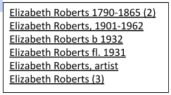
But there are still two entries that are essentially just name strings – the fl. and the ‘artist’ entry are essentially the same as those without any additional information in that they are name strings and they do not identify a person, so it makes sense to group all of these entries.

screenshot of shortest list of names with matching

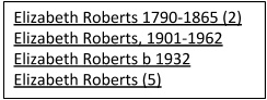
We now have a short set of entries. We can’t merge any more of them.

However, this does leave us with a problem. The end user is likely to assume that these all represent different people. That ‘Elizabeth Roberts’ is a different person from ‘Elizabeth Roberts 1901-1962’. The tricky thing is that she might be….and she might not be. It is likely that a user wanting Elizabeth Roberts with dates 1790-1865 would see the above list and click on the matching entry, not realising that the last three entries could also refer to the same person.  We don’t want to exclude these from the researcher’s thinking without hinting that they may represent the same person.

We might give the list a heading that hints at the reality, such as ‘We have found the following matches:’. Maybe ‘matches’ would have a tool tip to say that the entries without dates could match the entries with dates. It is quite hard to even find a way to say this succinctly and clearly.

The identifiable names would link to name pages. We might provide information on the name pages to again emphasise that other Elizabeth Roberts entries could be of interest. We haven’t yet decided what would be best in terms of behaviour for the non-identifiable names – they might simply link to a description search – it does not make much sense to have a full name page for an unidentified person where all you have is one link to one archive description. We can’t provide links to any other resources for a non-identifiable name; unless we simply provide e.g. a Wikipedia lookup on the name. But again, we face the issue of misleading the end user; implying a ‘same as’ link when we do not have enough grounds to do that.

Names as creators

We may decide to treat creator names differently. Archival creator does have a significant meaning – it emphasises that this is a collections about that person or organisation (though even the nature of the about-ness is difficult to convey). But many users do not necessarily appreciate what an archival creator is, and many descriptions don’t provide biographical histories, so could this end up creating confusion? Also, in the end a creator name is far more likely to include life dates, so then they would have a full name page anyway. What would be the benefit of treating a creator name with no life dates and no biographical history differently from an index term and giving it a name page? You would just be linking to one archive, albeit ‘their’ archive.

What about if a name string record, say the Elizabeth Roberts fl 1931, has been ingested as an EAC record, i.e. a name record that was created by one of our contributors? It is likely that name records will include a full date of birth, or at least a birth or death date, but this is not certain. Whilst we are not currently set up to take in EAC-CPF name records, we do plan to do this in the future. If the name is provided through an EAC record and they are a creator, they may have a detailed biography, and may have other useful information, such as a chronology, so a name page would be worthwhile.  

This short analysis shows some of the problems with providing a name-based interface. We will undoubtedly encounter more thorny issues. The challenge, as is so often the case, is just as much about how to convey meaning to end users when they are not necessarily familiar with archival perspectives, as it is about how to process the data.

And we haven’t even got to thinking about Eliza Roberts or Lizzy Roberts…..

How the Exploring British Design project informed the development of the Archives Hub

Back in 2014 the Archives Hub joined forces with The University of Brighton Design Archives for an exciting new project, funded by the Arts and Humanities Research Council, ‘Exploring British Design’ (EBD).

The project explored Britain’s design history by connecting design-related content in different archives, with the aim of giving researchers the freedom to explore around and within archives.

You can read a number of blog posts on the project, and there is also a video introducing the EBD website on You Tube, but in this post I wanted to set out how we have learned from the project and how it has informed the development of the new Archives Hub.

Unfortunately, we may not be able to maintain the website longer term, and so it seemed timely to reflect on how the principles used in this project are being taken forward.

Modelling the Data

A key component of EBD was our move away from the traditional approach of putting the archive collection at the centre of the user experience. Instead, we wanted to reflect the richness of the content – the people, organisations, places, subjects, events that a collection represents.

We had many discussions and filled many pieces of paper with ideas about how this might work.

rough ideas for data connectivity
Coming up with ideas for how EBD should work

We then took these ideas and translated them into our basic model.

model of data for EBD
Relationships between entities in the EBD data

Archives are represented on our model as one aspect of the whole. They are a resource to be referenced, as are bibliographic resources and objects. They relate to the whole – to agents, time periods, places and events. This essentially puts them into a whole range of contexts, which can expand as the data grows.

Screenshot of EBD homepage
Homepage of Exploring British Design: People are foremost.

The Exploring British Design website was one way to reflect the inter-connected model that we created.

We have taken the principles of this approach with the new Archives Hub architecture and website, which was launched back in December 2016. Whilst the archive collection description stays very much in the forefront of the users’ experience, we have introduced additional tabs to represent themed collections and repositories. All three of these sources of information are, in a data and processing sense, treated equally. The user searches the Hub and the search runs across these three data sources. The model allows us to be flexible with how we present the data, so we could also try different interfaces in future, maybe foregrounding images, or events.

screenshot of Archives Hub search results
Search for ‘design industry’ gives results across Archive Collections, Themed Collections and Repositories

Names

The EBD project had a particular focus on people. We opted to combine machine methods of data extraction – data taken partly from our already existent archive descriptions as well as from other external sources – with manual methods, to create rich records about designers. This manual approach is not sustainable for a large-scale service like the Archives Hub, but it shows what is possible in terms of creating more context and connectivity.

screenshot of a person page from the EBD website
EBD website showing a person page

We wanted to indicate that well-structured data allows a great deal more flexibility in presentation. In this case the ‘Archive and Museum Resources’ are one link in the list of resources about or related to the individual. We could have come up with other ways to present the information, given how it was structured.

We are intending to introduce names pages to the Archives Hub, which will then more clearly echo the EBD approach. They will largely have been created through automated processes, as we needed to create them at scale. They will generally be quite brief, without the ideal structure or depth, but the principle remains that we can then link from a person page to a host of related resources. The Hub website will have a new tab for ‘Names’ and end users will be able to run searches that take in collections, themes, repositories, people and organisations.

The EBD project allowed us to explore standards used for the creation of names data. It was our first experience of using Encoded Archival Context (Corporate Bodies, Persons and Families) (EAC-CPF), so we could start to see what we could do with it, as well as discover some of the shortcomings of the standard, as our data went beyond what is supported. For example, we wanted to link images to people and events but this was not covered by the standard. It was useful to have this preliminary exploration of it, and what it can – and can’t – do, as we look to adopt it for names within the Archives Hub.

Structured Data

One of the things the project did reinforce for me was the importance of indexing. On the Archives Hub we have always recommended indexing, but we have had mixed reactions from archivists, some feeling that it is less useful than detailed narrative, some saying that it is not needed ‘now we have Google’, some simply saying they don’t have time.

Indexing has many advantages, some of which I’ve touched on in various blog posts – and one at the top of the list, is that it brings the advantages of structured data. A name in a narrative can, in theory, be pulled out and utilised as a point of connectivity, but a name as an index term tends to be a great deal easier to work with: it is identified as a name, it usually has structured surname, forename content, it usually includes life dates and may include titles and epithets to help unambiguously identify an individual.

EBD was all about structured data, and we gave ourselves the luxury of adding to the data by hand, creating rich structured records about designers. This was partly to demonstrate what could be done in an interface, but we were well aware that it would be problematic to create records of that level of detail at scale. However, as we start to grapple with expanding name records in the Archives Hub, we have EBD as a reference point. It has helped us to think more about approaches and priorities when creating name records. If we were to create an EAC Editor (similar to our EAD Editor) we would think carefully about how to facilitate creating relationships. For example, the type of relationship – should there be a controlled list of relationship types? e.g. ‘worked with, collaborated with, had professional connection with, influenced by,  spouse of’ – these are some of the relationships we used in EBD, after much discussion about how best to approach this. Or would it be more practical to stick to ‘associated with’ (i.e. not defined), which is easier, but far less useful to a researcher. Could we have both? How would one combine them in an interface?  Another example – the potential to create timelines. If we wanted to provide end users with timelines, we would need to focus on time-bound events. There are many issues to consider here, not least of which is how comprehensive the timeline would be.

The vexed question of how to combine data from name descriptions created by several institutions is not something we really dealt with in EBD, but that will be one of the biggest challenges for us in aiming to implement name data on the Archives Hub.

The level of granularity that you decide upon has massive implications for complexity, resources and benefits. The more granular the data, the more potential for researchers to be able to drill down into lives, events, locations, etc. So including life dates allows for a search for designers from 1946; including places of education allows for exploring possible connections through education, but adding dates of education allows for a more specific focus still.

Explaining our approach

One thing that struck me about this project was that it was harder than I had anticipated to convey to people what we were trying to achieve and what we could achieve. I tended to find that showing the website raised a number of expectations that I knew would be difficult to fulfill, and if I’m being honest, I sometimes felt rather frustrated at the lack of recognition of what we had achieved – it’s really not easy to combine, process and present different data sources!  It is ironic that the more we press forwards with new functionality, and try to push the boundaries of what we do, the more it seems that people ask for developments that are beyond that!  You can try to modify expectations by getting deep down and technical with the challenges involved in aggregating and enhancing data created over time, by different people, in different environments (we worked with CSV data, EAC-CPF data, RDF and geodata for example), with different perspectives and priorities.  But detailed explanations of technical challenges are not going to work for most audiences. End users see and make an assessment of the website; they shouldn’t really need to be aware of what is going on behind the scenes.

Originally, in our project specification, we asked the question: “How can we encourage researchers, archive and museum professionals, and the public, to apprehend an integrated and extended rather than collection-specific sense of Britain’s design history?”  Whilst we did not go as far to answer this question as we had hoped, the work that we did made me feel that it might be harder than I had envisaged. People are very used to the traditional catalogues and other finding aids that are out there, and it creates a certain (possibly unconscious) mindset. I know this too well, because, as an archivist, I have had to adjust my own thinking to see data in a different way and appreciate that traditional approaches to cataloguing and discoverability are not always suited to the digital online age.

Data Model

The hierarchical approach to data is very embedded among archivists, and this is what people are used to being presented with.  Unless archivists catalogue in a different way, providing more structured information about entities (names, places, etc) then actually presenting things in a more connected way is hard.

image of hierarchical folders
A folder structure is often used to represent archival hierarchy

A more inter-connected model, which eschews linear hierarchy in favour of fluid entity relationships, and allows for a more flexible approach with the front-end interface to the data relies upon the quality, structure and consistency of the data. If we don’t have place names at all we can’t provide a search by place. If we don’t have place names that are unambiguously identified (i.e. not just ‘Cambridge’) then we can provide a search by place, but a researcher will be presented with all places called Cambridge, anywhere in the world (including the US, Australia and Jamaica).

A diagram showing archives and other entities connected
An example of connected entities

The new Archives Hub was designed on the basis of a model that allows for entities to be introduced and new connections made.

Archives Hub Entity Relationship diagram
Entities within the Archives Hub system

So, the tabs that the end user sees in the interface can be modified and extended over time. Searches can be run across all entities; it is not solely about retrieving descriptions of archives. This approach allows for researchers to find e.g. repositories that are significantly about ‘design’ or repositories that are located in London. It allows us to introduce Themed Collections as a separate type of description, so a student doing a project on ‘plastics’ would discover the Museum of Design in Plastics as a resource alongside archive collections at repositories including Brighton Design Archives, the V&A and the Paul Mellon Centre.

screenshot of Archives Hub search results
Search for ‘plastics and design’ shows archives and themed resources

Website Maintenance

One of the things I’ve learnt from this project is that you need to factor in the ongoing costs and effort of maintaining a project website. The EBD website is quite sophisticated, which means there are substantial technical dependencies, and we ended up running into issues with security, upgrades and compatibility of software, issues that are par for the course for a website but nonetheless need dealing with promptly. Maybe we should have factored this in more than we did, as we know the systems administration required for the Archives Hub is no small thing, but when you are in the throws of a project your focus is on the objectives and final output more than the ongoing issues. We cannot maintain a site long-term that is not being regularly used. EBD does not get the level of use that would justify the resources we would have to put into it on an ongoing basis.

Conclusion

When we were creating the model for the Archives Hub, we thought as much about flexibility and future potential as anything else. This is one thing that we have learnt from running the Hub for 25 years and from projects like Exploring British Design. You need to plan for potential developments in order to start to work with cataloguers, to get the data into the shape that you need it to be. We wanted to be able to introduce additional entities, so that we could have names, places, languages, images, or any other entities as ‘first class citizens‘ of the Hub. We wanted to be able to enhance the end user’s ability to take different paths, and locate relevant archives through different avenues of exploration.

We need to temper our ambitions for the Hub with the realities of cataloguing, aggregation and resources available, and we need as much information as we can get about what researchers really want; but this is why it is so important to encompass potential as well as current functionality. We may not be able to introduce everything we have envisioned or that users ask for right now; but it is important to understand the vital link between approaches to cataloguing, adherence to data standards, and front end functionality. We created visualisations for EBD and we would love to do this for the Hub, but it was not an easy thing to do, and so we would need to consider what the data allows, the software options available, whether the technical requirements are sustainable over time, and the effectiveness of the end result for the researcher.

Visualisation showing connections to Elizabeth Denby
Visualisation for Elizabeth Denby

When we demonstrated the visualisations in EBD, they had the wow factor that was arguably lacking in the main text-based site, but for serious researchers the wow factor is a great deal less important that the breadth and depth of the content, and that requires a model that is fundamentally rigorous, sustainable over time and realistic in terms of the data that you have to work with.


The Website for the New Archives Hub

screenshot of archives hub homepage
Archives Hub homepage

The back end of a new system usually involves a huge amount of work and this was very much the case for the Archives Hub, where we changed our whole workflow and approach to data processing (see The Building Blocks of the new Archives Hub), but it is the front end that people see and react to; the website is a reflection of the back end, as well as involving its own user experience challenges, and it reflects the reality of change to most of our users.

We worked closely with Knowledge Integration in the development of the system, and with Gooii in the design and implementation of the front end, and Sero ran some focus groups for us, testing out a series of wireframe designs on users. Our intention was to take full advantage of  the new data model and processing workflow in what we provided for our users. This post explains some of the priorities and design decisions that we made. Additional posts will cover some of the areas that we haven’t included here, such as the types of description (collections, themed collections, repositories) and our plan to introduce a proximity search and a browse.

Speed is of the Essence

Faster response times were absolutely essential and, to that end, a solution based on an enterprise search solution (in this case Elasticsearch) was the starting point. However, in addition to the underlying search technology, the design of the data model and indexing structure had a significant impact on system performance and response times, and this was key to the architecture that Knowledge Integration implemented. With the previous system there was only the concept of the ‘archive’ (EAD document) as a whole, which meant that the whole document structure was always delivered to the user whatever part of it they were actually interested in, creating a large overhead for both processing and bandwidth. In the new system, each EAD record is broken down into many separate sections which are each indexed separately, so that the specific section in which there is a search match can be delivered immediately to the user.

To illustrate this with an example:-

A researcher searches for content relating to ‘industrial revolution’ and this scores a hit on a single item 5 levels down in the archive hierarchy. With the previous system the whole archive in which the match occurs would be delivered to the user and then this specific section would be rendered from within the whole document, meaning that the result could not be shown until the whole archive has been loaded. If the results list included a number of very large archives the response time increased accordingly.

In the new system, the matching single item ‘component’ is delivered to the user immediately, when viewed in either the result list or on the detail page, as the ability to deliver the result is decoupled from archive size. In addition, for the detail page,  a summary of the structure of the archive is then built  around the item to provide both the context and allow easy navigation.

Even with the improvements to response times, the tree representation (which does have to present a summary of the whole structure), for some very large multi-level descriptions takes a while to render, but the description itself always loads instantly. This means that that the researcher can always see they have a result immediately and view it, and then the archival structure is delivered (after a short pause for very large archives) which gives the result context within the archive as a whole.

The system has been designed to allow for growth in both the number of contributors we can support and  the number of end-users, and will also improve our ability to syndicate the content to both Archives Portal Europe and deliver contributors own ‘micro sites‘.

Look and Feel

Some of the feedback that we received suggested that the old website design was welcoming, but didn’t feel professional or academic enough – maybe trying to be a bit too cuddly. We still wanted to make the site friendly and engaging, and I think we achieved this, but we also wanted to make it more professional looking, showing the Hub as an academic research tool.  It was also important to show that the Archives Hub is a Jisc service, so the design Gooii created was based upon the Jisc pattern library that we were required to use in order to fit in with other Jisc sites.

We have tried to maintain a friendly and informal tone along with use of cleaner lines and blocks, and a more visually up-to-date feel. We have a set of consistent icons, on/off buttons and use of show/hide, particularly with the filter. This helps to keep an uncluttered appearance whilst giving the user many options for navigation and filtering.

In response to feedback, we want to provide more help with navigating through the service, for those that would like some guidance. The homepage includes some ‘start exploring’ suggestions for topics, to help get inexperienced researchers started, and we are currently looking at the whole ‘researching‘ section and how we can improve that to work for all types of users.

Navigating

We wanted the Hub to work well with a fairly broad search that casts the net quite widely. This type of search is often carried out by a user who is less experienced in using archives, or is new to the Hub, and it can produce a rather overwhelming number of results. We have tried to facilitate the onward journey of the user through judicious use of filtering options. In many ways we felt that filtering was more important than advanced search in the website design, as our research has shown that people tend to drill down from a more general starting point rather than carry out a very specific search right from the off.  The filter panel is up-front, although it can be hidden/shown as desired, and it allows for drilling down by repository, subject, creator, date, level and digital content.

Another way that we have tried to help the end user is by using typeahead to suggest search results. When Gooii suggested this, we gave it some thought, as we were concerned that the user might think the suggestions were the ‘best’ matches, but typeahead suggestions are quite a common device on the web, and we felt that they might give some people a way in, from where they could easily navigate through further descriptions.

Hub website example of type ahead results
A search for ‘design’ with suggested results


The suggestions may help users to understand the sort of collections that are described on the Hub. We know that some users are not really aware of what ‘archives’ means in the context of a service like the Archives Hub, so this may help orientate them.

Suggested results also help to explain what the categories of results are – themes and locations are suggested as well as collection descriptions.


We thought about the usability of the hit list. In the feedback we received there was no clear preference for what users want in a hit list, and so we decided to implement a brief view, which just provides title and date, for maximum number of results, and also an expanded view, with location, name of creator, extent and language, so that the user can get a better idea of the materials being described just from scanning through the hit list.

An example of a hit list result in expanded mode
Expanded mode gives the user more information

With the above example, the title and date alone do not give much information, which is particularly common with descriptions of series or items, of so the name of creator adds real value to the result.

Seeing the Wood Through the Trees

The hierarchical nature of archives is always a challenge; a challenge for cataloguing,  processing and presentation. In terms of presentation, we were quite excited by the prospect of trying something a bit different with the new Hub design. This is where the ‘mini map’ came about. It was a very early suggestion by K-Int to have something that could help to orientate the user when they suddenly found themselves within a large hierarchical description. Gooii took the idea and created a number of wireframes to illustrate it for our focus groups.

For instance, if a user searches on Google for ‘conrad slater jodrell bank’ then they get a link to the Hub entry:

screenshot of google search result for a Hub description
Result of a search on Google

The user may never have used archives, or the Archives Hub before. But if they click on this link, taking them directly to material that sits within a hierarchical description, we wanted them to get an immediate context.

screen shot of one entry in the Jodrell Bank Archive
Jodrell Bank Observatory Archives: Conrad Slater Files

The page shows the description itself, the breadcrumb to the top level, the place in the tree where these particular files are described and a mini map that gives an instant indication of where this entry is in the whole. It is  intended (1) to give a basic message for those who are not familiar with archive collections – ‘there is lots more stuff in this collection’ and (2) to provide the user with a clearly understandable  expanding tree for navigation through this collection.

One of the decision we made, illustrated here, was to show where the material is held at every level, for every unit of description. The information is only actually included at the top level in the description itself, but we can easily cascade it down. This is a good illustration of where the approach to displaying archive descriptions needs to be appropriate for the Web – if a user comes straight into a series or item, you need to give context at that level and not just at the top level.

The design also works well for searches within large hierarchical descriptions.

screenshot showing a 'search within' with highlighted results
Search for ‘bicycles’ within the Co-operative Union Photographic Collection

The user can immediately get a sense of whether the search has thrown up substantial results or not. In the example above you can see that there are some references to ‘bicycles’ but only early on in the description.  In the example below, the search for ‘frost on sunday’ shows that there are many references within the Ronnie Barker Collection.

screenshot showing search within with lots of highlighted results
Search within the Ronnie Barker Collection for ‘frost on sunday’

One of the challenges for any archive interface is to ensure that it works for experienced users and first-time users. We hope that the way we have implemented navigation and searching mean that we have fulfilled this aim reasonably well.

Small is Beautiful

screenshot showing the Hub search on a mobile phone
The Archives Hub on an iPhone

The old site did not work well on mobile devices. It was created before mobile became massive, and it is quite hard to retrospectively fit a design to be responsive to different devices. Gooii started out with the intention of creating a responsive design, so that it renders well on different sized screens.  It requires quite a bit of compromise, because rendering complex multi-level hierarchies and very detailed catalogues on a very small screen is not at all easy. It may be best to change or remove some aspects of functionality in order to ensure the site makes sense. For example, the mobile display does not open the filter by default, as this would push the results down the page. But the user can open the filter and use the faceted search if they choose to do so.

We are particularly pleased that this has been achieved, as something like 30% of Hub use is on mobiles and tablets now, and the basic search and navigation needs to be effective.

graph showing use of desk, mobile and tablet devices on the Hub
Devices used to view the Hub site over a three month period

In the above graph, the orange line is desktop, the green is mobile and the purple is tablet. (the dip around the end of December is due to problems setting up the Analytics reporting).

Cutting Our Cloth

One of the lessons we have learnt over 15 years of working on the Archives Hub is that you can dream up all of the interface ideas that you like, but in the end what you can implement successfully comes down to the data. We had many suggestions from contributors and researchers about what we could implement, but oftentimes these ideas will not work in practice because of the variations in the descriptions.

We though about implementing a search for larger, medium sized or smaller collections, but you would need consistent ‘extent’ data, and we don’t have that because archivists don’t use any kind of controlled vocabulary for extent, so it is not something we can do.

When we were running focus groups, we talked about searching by level – collection, series, sub-series, file, item, etc. For some contributors a search by a specific level would be useful, but we could only implement three levels – collection (or ‘top level’), item (which includes ‘piece’) and then everything between these, because the ‘in-between’ levels don’t lend themselves to clear categorisation. The way levels work in archival description, and the way they are interpreted by repositories, means we had to take a practical view of what was achievable.

We still aren’t completely sold on how we indicate digital content, but there are particular challenges with this. Digital content can be images that are embedded within the description, links to images, or links to any other digital content imaginable. So, you can’t just use an image icon, because that does not represent text or audio. We ended up simply using a tick to indicate that there is digital content of some sort. However, one large collection may have links to only one or two digital items, so in that case the tick may raise false expectations. But you can hardly say ‘includes digital content, but not very much, so don’t get too excited’. There is  room for more thought about our whole approach to digital content on the Hub, as we get more links to digital surrogates and descriptions of born-digital collections.

Statistics

The outward indication of a more successful site is that use goes up. The use of statistics to give an indication of value is fraught with problems. Do the number of clicks represent value? Might more clicks indicate a poorer user interface design? Or might they indicate that users find the site more engaging? Does a user looking at only one description really gain less value than a user looking at ten descriptions? Clearly statistics can only ever be seen as one measure of value, and they need to be used with caution. However, the reality is that an upward graph is always welcomed! Therefore we are pleased to see that overall use of the website is up around 32% compared to this period during the previous year.

graph of blog stats comparing dataJan 2016 (the orange line) and Jan 2017 (the blue line), which shows typical daily use above 2,000 page views.

Feedback

We are pleased to say that the site has been very well received…

“The new site is wonderful. I am so impressed with its speed and functionality, as well as its clean, modern look.” (University Archivist)

“…there are so many other features that I could pick out, such as the ability to download XML and the direct link generator for components as well as collections, and the ‘start exploring’ feature.”  (University Archivist)

“Brand new Archives Hub looks great. Love how the ‘explorer themes’ connect physically separated collections” (Specialist Repository Head of Collections)

“A phenomenal achievement!” (Twitter follower)


With thanks to Rob Tice from Knowledge Integration for his input to this post.

Save

Exploring British Design: Interface Design Principles

Britain Can Make It exhibition poster
Britain Can Make It, exhibition poster

For our AHRC project, ‘Exploring British Design‘ one of the questions we asked is:

How might a website co-designed by researchers, rather than a top-down collection-defined approach to archive content, enhance engagement with and understanding of British design?

The workshops that we have run were one of the key ways that we hoped to understand more about how postgraduates and others research their topics, what they liked and didn’t like about websites, and in a general sense how they think and understand resources, and how we can tune into that thinking.


In the blogs posts that we have created so far, we set out one of our central ideas:

Providing different routes into archives, showing different contexts, and enabling researchers to create their own narratives, can potentially be achieved through a focus on the ‘real things’ within an archive description; the people, organisations and places, and also the events surrounding them.

The feedback from the workshops gave us plenty to work with, and here I wanted to draw out some of the key messages that we are using to help us design an interface.

Researchers often think visually

Several of the participants in our workshops were visual thinkers. Maybe we had a slightly biased group, in that they work within or study design, but it seems reasonable to conclude that a visual approach can be attractive and engaging. We want to find a way to represent information more visually, whilst providing a rich and detailed resource. Our belief is that the visual should not dominate or hide the textual, as does often happen with cultural heritage resources, but that they should work better together.

Researchers often think in terms of creating a story or narrative

When we asked our participants to focus on an individual object, several of them thought in terms of its ‘story’. It seemed to me that most of the discussions that we had assumed a narrative type approach. It is hardy surprising, as when we talk about people, places and events we connect them together. It is a natural thing to do.

Different types of contexts provide value

When we asked workshop participants to think about how they would go about researching the object they were given, they tended to think of ways to contextualise it. They were interested in where it came from, in its physicality and its story. For example, we gave out photographs of an exhibition and they wanted to know where the photographs were taken, more about the exhibition and the designers involved in it, what else was going on at that time?   Our idea with Exploring British Design is that we can create records that allow these kinds of contexts to flourish. The participants did not concentrate on traditional archival context, as they did not tend to recognise this in the same way as archivists – it is one perspective amongst many.

We cannot provide a substitute for the value of handling the original object, and it was clear that researchers found this to be immensely valuable, but we can help to provide context that helps to scope reality.

Uncovering the obscure is a good thing

Not surprisingly, our workshop participants were keen that their research efforts should result in finding little-known information that they could utilise. They talked about the excitement of uncovering information and the benefits for their work.

Habits are part of the approach to research

The balance between being innovative and anchoring an interface in what people are familiar with seems to be important.

Trust is very important

The importance of trust was stressed at all of our workshops, and the need to know the context of information. We need to build something that researchers believe is a quality resource, with information they can rely on.

Serendipity is good…although it can lead you astray

It was clear that our participants wanted to explore, and liked the idea of coming across the unexpected. Several of them felt that the library bookshelves provide a good opportunity to browse and discover new sources (they talked about this more than the serendipity of the web). But there was also a note of caution about time wasted pursuing different avenues of information. It seems good to build in serendipity, whilst providing an interface that gives clear landmarks and signposts.

Search and Relevance

Our workshop participants were clear that choice of search terms has a big influence on what you find, and this can be a disadvantage. You may be presented with a search box, and you don’t really know what to search for to get what you want, especially if you don’t know what you want! Also, the relevance ranking can be a puzzle. Library databases often seem to give results that don’t make that much sense.

One thing that stood out to me was the willingness to use Google, which is a simple search box, with no indication of how to search, that brings back huge amounts of results; but the criticisms of library databases, where choice of search term is crucial and where ‘too many results’ are seen as a problem. It seemed that the key here was effective relevance ranking, but our workshop participants did agree that relevance ranking can deceive: the first page of results may look good, but you don’t really know what you are missing. Google is good at providing a first page of useful looking results….and maybe that’s enough to stop most people wondering about what they might be missing!

 Exploring British Design

As our project has progressed, I think it is fair to say that we have benefitted hugely from the input of the students and academics that we have talked to, not only for this project but also more generally. But it was not possible for us to manage to implement a directly co-designed website. The logistics of the project didn’t allow for this, as we wanted to gather input to inform the project, and then we had the complications of pulling together the data, designing the back end and the API. We would probably have needed at least another 6 months on the project to go back to the workshop participants and ask them about the website design as we went along.

But I think we have achieved a good deal in terms of engagement. Our Exploring British Design project has been about other ways through content, moving away from a search box and a list of search results, and thinking about immersing researchers in a ‘landscape’, where they can orientate themselves but also explore freely. So, we are thinking about engagement in terms of a more visually attractive and immersive experience, giving researchers the opportunity to follow connections in a way that gives them a sense of movement through the design landscape, hints at the unknown, and shows the relevancy of the entities that are featured in the website.  We hope to show how this can potentially expand understanding because it allow for a wider context and more varied narratives.

In the next project post we hope to present our interface for this pilot project!


Europeana Tech 2015: focus on the journey

Last week I attended a very full and lively Europeana Tech conference. Here are some of the main initiatives and ideas I have taken away with me:

Think in terms of improvement, not perfection

Do the best you can with what you have; incorrect data may not be as bad as we think and maybe users expectations are changing, and they are increasingly willing to work with incomplete or imperfect data. Some of the speakers talked about successful crowd-sourcing – people are often happy to correct your metadata for you and a well thought-out crowd-sourcing project can give great results.

BL Georeferencer, showing an old map overlaying part of Manchester: http://www.bl.uk/maps/georeferencingmap.html

The British Library currently have an initiative to encourage tagging of their images on Flickr Commons and they also have a crowd-sourcing geo-referencer project.

The Cooper Hewitt Museum site takes a different and more informal approach to what we might usually expect from a cultural heritage site. The homepage goes for an honest approach:

“This is a kind of living document, meaning that development is ongoing — object research is being added, bugs are being fixed, and erroneous terms are being revised. In spite of the eccentricities of raw data, you can begin exploring the collection and discovering unexpected connections among objects and designers.”

The ‘here is some stuff’ and ‘show me more stuff’ type of approach was noticeable throughout the conference, with different speakers talking about their own websites. Seb Chan from the Cooper Hewitt Museum talked about the importance of putting information out there, even if you have very little, it is better than nothing (e.g. https://collection.cooperhewitt.org/objects/18446665).

The speaker from Google, Chris Welty, is best known for his work on ontologies in the Semantic Web and IBM’s Watson. He spoke about cognitive computing, and his message was ‘maybe it’s OK to be wrong’. Something may well still useful, even if it is not perfectly precise. We are increasingly understanding that the Web is in a state of continuous improvement, and so we should focus on improvement, not perfection. What we want is for mistakes to decrease, and for new functionality not to break old functionality.  Chris talked about the importance of having a metric – something that is believable – that you can use to measure improvement. He also spoke about what is ‘true’ and the need for a ‘ground truth’ in an environment where problems often don’t have a right or wrong answer. What is the truth about an image? If you show an image to a human and ask them to talk about it they could talk for a long time. What are the right things to say about it? What should a machine see? To know this, or to know it better, Chris said, Google needs data – more and more and more data. He made it clear that the data is key and it will help us on the road to continuous improvement. He used the example of searching for pictures of flowers using Google to find ‘paintings with flowers’. If you did this search 5 years ago you probably wouldn’t get just paintings with flowers. The  search has improved, and it will continue to improve.  A search for ‘paintings with tulips’ now is likely to show you just tulips. However, he gave the example of  ‘paintings with flowers by french artists’ –  a search where you start to see errors as the results are not all by french artists. A current problem Google are dealing with is mixed language queries, such as  ‘paintings des fleurs’, which opens a whole can of worms. But Chris’ message was that metadata matters: it is the metadata that makes this kind of searching possible.

The Success of Failure

Related to the point about improvement, the message is that being ‘wrong’ or ‘failing’ should be seen in a much more positive light. Chris Welty told us that two thirds of his work doesn’t make it into a live environment, and he has no problem with that. Of course, it’s hard not to think that Google can afford to fail rather more than many of us! But I did have an interesting conversation with colleagues, via Twitter, around the importance of senior management and funders understanding that we can learn a great deal from what is perceived as failure, and we shouldn’t feel compelled to hide it away.

Photo from Europeana Tech
Europeana Tech panel session, with four continents represented

Think in terms of Entities

We had a small group conversation where this came up, and a colleague said to me ‘but surely that’s obvious’. But as archivists we have always been very centered on documents rather than things – on the archive collection, and the archive collection description. The  trend that I was seeing reflected at Europeana Tech continued to be towards connections, narratives, pathways, utilising new tools for working with data, for improving data quality and linking data, for adding geo-coordinates and describing new entities, for making images more interoperable and contextualising information. The principle underlying this was that we should start from the real world – the real world entities – and go from there. Various data models were explored, such as the Europeana Data Model and CIDOC CRM, and speakers explained how entities can connect, and enable a richer landscape. Data models are a tricky one because they can help to focus on key entities and relationships, but they can be very complex and rather off-putting. The EDM seems to split the crowd somewhat, and there was some criticism that it is not event-based like CIDOC CRM, but the CRM is often criticised for being very complex and difficult to understand. Anyway, setting that aside, the overall the message was that relationships are key, however we decide to model them.

Cataloguing will never capture everyone’s research interests

An obvious point, but I thought it was quite well conveyed in the conference. Do we catalogue with the assumption that people know what they need? What about researchers interested in how ‘sad’ is expressed throughout history, or fashions for facial hair, or a million other topics that simply don’t fit in with the sorts of keywords and subject terms we normally use. We’ll never be able to meet these needs, but putting out as much data as we can, and making it open, allows others to explore, tag and annotate and create infinite groups of resources. It can be amazing and moving, what people create: Every3Minutes.

There’s so much out there to explore….

There are so many great looking tools and initiatives worth looking at, so many places to go and experiment with open data, so many APIs enabling so much potential. I ended up with a very long list of interesting looking sites to check out. But I couldn’t help feeling that so few of us have the time or resource to actually take advantage of this busy world of technology. We heard about Europeana Labs, which has around 100 ‘hardcore’ users and 2,200 registered keys (required for API use). It is described as “a playground for remixing and using your cultural and scientific heritage. A place for inspiration, innovation and sharing.” I wondered if we would ever have the time to go and have a play. But then maybe we should shift focus away from not being able to do these things ourselves, and simply allow others to use the data, and to adopt the tools and techniques that are available – people can create all sorts of things. One example amongst many we heard about at the conference is a cultural collage: zenlan.com/collage. It comes back to what is now quite an old adage, ‘the best innovation may not be done by you’. APIs enable others to innovate, and what interests people can be a real surprise. Bill Thompson from the BBC referred to a huge interest in old listings from Radio Times, which are now available online.

The International Image Interoperability Framework

I list the IIIF this because it jumped out at me as a framework that seems to be very popular – several speakers referred to it, and it very positive terms. I hadn’t heard of it before, but it seemed to be seen as a practical means to ensure that images are interoperable, and can be moved around different systems.

Think Little

One of my favourite thoughts from the conference, from the ever-inspirational Tim Sherratt, was that big ideas should enable little ideas. The little ideas are often what really makes the world go round. You don’t have to always think big. In fact, many sites have suffered from the tendency to try to do everything. Just because you can add tons of features to your applications, it doesn’t mean you should

The Importance of Orientation

How would you present your collections if you didn’t have a search box? This is the question I asked myself after listening to George Oates, from Good Form and Spectacle. She is a User Interface expert, and has worked on Flickr and for the Internet Archive amongst other things. I thought her argument about the need to help orientate users was interesting, as so often we are told that the ‘Google search box’ is the key thing, and what users expect. She talked about some of her experiments with front end interfaces that allow users to look at things differently, such as the V&A Spelunker. She spoke in terms of landmarks and paths that users could follow. I wonder if this is easier said than done with archives without over-curating what you have or excluding material that is less well catalogued, or does not have a nice image to work with. But I certainly think it is an idea worth exploring.

View of V&A Speleunker
“The V&A Spelunker is a rough thing built by Good, Form & Spectacle to give a different view into the collection of the Victoria & Albert Museum”

ICT and the Student Experience

A HEFCE study from 2010 states that “96% of students use the internet as a source of information” (1). This makes me wonder about the 4% that don’t; it’s not an insignificant number. The same study found that “69% of students use the internet daily as part of their studies”, so 31% don’t use it on a daily basis (which I take to mean ‘very frequently’).

There have been many reports on the subject of technology and its impact on learning, teaching and education. This HEFCE/NUS study is useful because it concentrates on surveying students rather than teachers or information professionals. One of the key findings is that it is important to think about the “effective use of technology” and “not just technology for technology’s sake”. Many students still find conventional methods of teaching superior (a finding that has come up in other studies), and students prefer a choice in how they learn. However, the potential for use of ICT is clear, and the need to engage with it is clear, so it is worrying that students believe that a significant number of staff “lack even the most rudimentary IT skills”. It is hardy surprising that the experiences of students vary considerably when they are partly dependent upon the skills and understanding of their teachers, and whether teachers use technology appropriately and effectively.

At the recent ELAG conference I gave a joint presentation with Lukas Koster, a colleague from the University of Amsterdam, in which we talked about (and acted out via two short sketches) the gap between researchers’ needs and what information professionals provide. Thinking simply about something as seemingly obvious as the understanding and use of

Examples of interface terminology from archives sites
Random selection of interface terminology from archives sites.

the term ‘archives’ is a good case in point. Should we ensure that students understand the different definitions of archives? The distinction between archives that are collections with a common provenance and archives that are artificial collections? The different characters of archives that are datasets, generally used by social scientists? The “abuse” of the term archives for pretty much anything that is stored in any kind of longer-term way? Should users understand archival arrangement and how to drill down into collections? Should they understand ‘fonds’, ‘manuscripts’, ‘levels’, ‘parent collection’? Or is it that we should think more about how to translate these things into everyday language and simple design, and how to work things like archival hierarchy into easy-to-use interfaces?  I think we should take the opportunities that technology provides to find ways to present information in such a way that we facilitate the user experience. But if students are reporting a lack of basic ICT skills amongst teachers, you have to wonder whether this is a problem within the archive and library sector as well. Do information professionals have appropriate ICT skills fit for ensuring that we can tailor our services to meet the needs of the technically savvy user?

Should we be teaching information literacy to students? One of the problems with this idea is that they tend to think they are already pretty literate in terms of use of the internet. In the HEFCE report, a survey of 213 FE students found that 88% felt they were effective online researchers and the majority said they were self-taught. They would not be likely to attend training on how to use the internet. And there is a question over whether they need to be taught how to use it in the ‘right’ way, or whether information professionals should, in fact, work with the reality of how it is being used (even if it is deemed to be ‘wrong’ in some way).  Students are clear that they do want training “around how to effectively research and reference reliable online resources”, and maybe this is what we should be concentrating on (although it might be worth considering what ‘effective use of the internet’ and ‘effective research using the internet’ actually mean). Maybe this distinction highlights the problem with how to measure effective use of the internet, and how to define online or discovery skills.

A British Library survey from 2010 found that “only a small proportion [of students] …are using technology such as virtual-research environments, social bookmarking, data and text mining, wikis, blogs and RSS-feed alerts in their work.”  This is despite the fact that many respondents in the survey said they found such tools valuable. This study also showed that students turn to their peers or supervisors rather than library staff for help.

Part of the problem may be that the vast majority of users use the internet for leisure purposes as well as work or study, so the boundaries can become blurred, and they may feel that they are adept users without distinguishing between different types of use. They feel that they are ‘fine with the technology’, although I wonder if that could be because they spend hours playing World of Warcraft, or use Facebook or Twitter every day, or regularly download music and watch YouTube. Does that mean they will use technology in an effective way as part of their studies? The trouble is that if someone believes that they are adept at searching, they may not go that extra mile to reflect on what they are doing and how effective it really is. Do we need to adjust our ways of thinking to make our resources more user-friendly to people coming from this kind of ‘I know what I’m doing’ mindset, or do we have to disabuse them of this idea and re-train them (or exhort them to read help pages for example…which seems like a fruitless mission)? Certainly students have shown some concern over “surface learning” (skim reading, learning only the minimum, and not getting a broader understanding of issues), so there is some recognition of an issue here, and the tendency to take a superficial approach might be reinforced if we shy away from providing more sophisticated tools and interfaces.

The British Library report on the Information Behaviour of the Researcher of the Future reinforces the idea that there is a gulf between students’ assumptions regarding their ICT skills versus the reality, which reveals a real lack of understanding. It also found a significant lack of training in discovery and use of tools for postgraduate students. Studies like this can help us think about how to design our websites, and provide tools and services to help researchers using archives. We have the challenges of how to make archives more accessible and easy to discover as well as thinking about how to help students use and interpret them effectively: “The college students of the open source, open content era will distinguish themselves from their peers and competitors, not by the information they know, but by how well they convert that knowledge to wisdom, slowly and deeply internalized.” (Sheila Stearns, “Literacy in the University of 2025: Still A Great Thing‟, from The Future of Higher Education , ed. by Gary Olson & John W Presley, (Boulder: Paradigm Publishers, 2009) pp. 98-99).

What are the Solutions?

We should make user testing more integral to the development of our interfaces. It requires resource, but for the Archives Hub we found that even carrying out 10 one-hour interviews with students and academics helped us to understand where we were making assumptions and how we could make small modifications that would improve our site. And our annual online survey continues to provide really useful feedback which we use to adjust our interface design, navigation and terminology. We can understand more about our users, and sometimes our assumptions about them are challenged.

graph showing where people came from who visited the Hub
Archives Hub survey 2013: Why did you come to the Hub today?

User groups for commercial software providers can petition to ensure that out-of-the-box solutions also meet users’ needs and take account of the latest research and understanding of users’ experiences, expectations and preferences in terms of what we provide for them. This may be a harder call, because vendors are not necessarily flexible and agile; they may not be willing to make radical changes unless they see a strong business case (i.e. income may be the strongest factor).

We can build a picture of our users via our statistics. We can look at how users came into the site, the landing pages, where they went from there, which pages are most/least popular, how long they spent on individual pages, etc. This can offer real insights into user behaviour. I think a few training sessions on using Google Analytics on archive sites could come in handy!

We can carry out testing to find out how well sites rank on search engines, and assess the sort of experience users get when they come into a specialist site from a general search engine. What is the text a Google search shows when it finds one of your collections? What do people get to when they click on that link? Is it clear where they are and what they can do when they get to your site?

 * * *

This is the only generation where the teachers and information professionals have grown up in a pre-digital world, and the students (unless they are mature students) are digital natives. Of course, we can’t just sit back and wait a generation for the teachers and information professionals to become more digitally minded! But it is interesting to wonder whether in 25 years time there will be much more consensus in approaches to and uses of ICT, or whether the same issues will be around.

Nigel Shadbolt has described the Web as “one of the most disruptive innovations we have ever witnessed” and at present we really seem to be struggling to find out how best to use it (and not use it), how and when to train people to use it and how and when to integrate it into teaching, learning and research in an effective way.

It seems to me that there are so many narratives and assessments at present – studies and reports that seem to run the gamut of positive to negative. Is technology isolating or socialising? Are social networks making learning more superficial or enabling richer discussion and analysis? Is open access democratising or income-reducing? Is the high cost of technology encouraging elitism in education? Does the fact that information is so easily accessible mean that researchers are less bothered about working to find new sources of information?  With all these types of debates there is probably no clear answer, but let us hope we are moving forward in understanding and in our appreciation of what the Web can do to both enhance and transform learning, teaching and research.

With a little help from the Interface

It is tempting to forge ahead with ambitious plans for Web interfaces that grab the attention, that look impressive and do new and whizzy things. But I largely agree with Lloyd Rutledge that we want “less emphasis on grand new interfaces” (Lloyd Rutledge, The Semantic Web – ISWC 2010, Selected Papers). I think it is important to experiment with exciting, innovative interfaces, but the priority needs to be creating interfaces that are effective for users, and that usually means a level of familiarity and supporting the idea that “users of the Web feel it acts they way they always knew it should (even though they actually couldn’t imagine it beforehand).” Maybe the key is to make new things feel familiar, so that we aren’t asking users to learn a whole new literacy, but a new literacy will gradually emerge and evolve.

For the Archives Hub, we face similar challenges to many websites that promote and provide access to archives, although our challenges are compounded by being an aggregator and not being in control of the content of the descriptions. We are seeking to gradually modify and improve our interfaces, in the hope that we help to make the users’ discovery experiences more effective, and encourage people to engage with archives.

One of our aims is to introduce options for users that allow them to navigate around in a fairly flexible manner, meeting different levels of experience and need, but without cluttering the screen or making the navigation look complicated and off-putting. Interviews with researchers have indicated how people have a tendency to ‘click and see’, learning as they go, but expecting useful results fairly quickly, so we want to work with this principle, to use hyperlinks effectively, on the understanding that the terminology used and the general layout of the page will have an effect on user expectations.

A Separation of Parts

One of the issues when presenting an archival description is how to separate out the ‘further actions’ or ‘find out more’ from the basic content. The challenge here is compounded by the fact that researchers often believe the description is the actual content, and not just metadata, or alternatively they assume that they can always access a digital resource.

We have tried to simplify the display by introducing a Utility Bar. It is intended to bring together the further options available to the end user. The idea is to make the presentation neater, show the additional options more clearly, and also keep the main description clear and self-contained.

Archives Hub description


The user can click to find out how to access the materials, to find out where the repository is located in the UK or contact the repository by email. We are planning to make the email contact link more direct, opening an email and populating it with the email address of the repository in order to cut down on the number of stages the user has to go through (currently we link to the Archon directory of Archive services). We can also modify other aspects of the Utility Bar over time, adding functionality as required, so it is a way to make the display more extensible.

We have included links to social networking sites, although in truth we have no real evidence that these are required or used. This really was a case of ‘suck it and see’ and it will be interesting to investigate whether this functionality really is of value. We certainly have a lively following on Twitter, and indications are that our Twitter presence is valued, so we do believe that social networking sites play an important part in what we do.

We have also included the ability to view different formats. This will not be of value to most researchers, but it is  intended to be part of our mission to open up the data and give a sense of transparency – anyone can see the encoding behind the description and see that it is freely available. Some of our contributors may find it useful, as well as developers interested in the XML behind the scenes.

The Biggest Challenge: how to present an archive description

Until recently we presented users with an initial hit list of results, which enabled them to see the title of a description and choose between a ‘summary’ presentation and a ‘full’ presentation. However, feedback indicates that users don’t know what we mean by this. Firstly, they haven’t yet seen the description, so there is nothing on which to base the choice of  link to click, and secondly, what is the definition of ‘summary’ and ‘full’ anyway? Our intention was to give the user the choice of a fairly brief, one page summary description, with the key descriptive data about the archive collection, or the full, complete description, which may run to many pages. A further consideration was that we could only provide highlighting of terms on a single page, so if we only had the full description, highlighting would not be possible.

There are a number of issues here. (a) Descriptions may be exactly the same for summary and full because sometimes they are short, only including key fields, and they do not provide multi-level content; the full description will only provide more information if the cataloguer has filled in additional fields, or created a multi-level display. (b) ‘Summary’ usually means a cut-down version of something, taking key elements, but we do not do this; we simply select what we believe to be the key fields. For example, Scope and Content may actually be very long and detailed, but it would always be part of the ‘summary’ description. (c) Fields that are excluded from the summary view may be particularly important in some cases – for example, the collection may be closed for a period of time, and this would really be key information for a researcher.

With the new Utility Bar we changed ‘summary’ and ‘full’ to become ‘brief’ and ‘detailed’. We felt that this more accurately reflects what these options represent. At present we have continued with the same principle of displaying selected fields in the ‘brief’ description, but we feel that this approach should be revised. After much discussion, we have (almost) decided that we will change our approach here. The brief description will become simply the collection-level description in its entirety; the detailed description will be the multi-level description. This gives the advantage of a certain level of consistency, but there are still potential pitfalls. Two of the key issues are (a) that ‘brief’ may actually be quite long (a collection description can still be very long) and (b) that many descriptions are not multi-level, so there would be no difference between the two descriptions. Therefore, we will look at creating a scenario where the user only gets the ‘Detailed Description’ link when the description is multi-level. If we can do this we will may change the terminology; but in the end there is no real user-friendly way to succinctly describe a collection-level as opposed to a multi-level description, simply because many people are not aware of what archival hierarchy really means.

Archives Hub list of resultsAs well as introducing the Utility Bar we changed the hit list of results to link the title of the description to the brief view. We simply show the title and the date(s) of the archive, as we feel that these are the key pieces of information that the researcher needs  in order to select relevant collections to view.


Centralised Innovation

For some of the more complex changes we want to make, we need to first of all centralise the Archives Hub, so that the descriptions are all held by us. For some time we thought that this seemed like a retrograde step: to move from a federated system to a centralised system. But a federated system adds a whole layer of complexity because not only do you not have control over the data you are presenting; you do not have control over some of the data at all, to view it, and examine any issues with it, and also to potentially improve the consistency (of the markup in particular). In addition, there is a dependency between the centralised system and the local systems that form the federated model. Centralising the data will actually allow us to make it more openly available as well, and to continue to innovate more easily.

Multiple Gateways: Multiple Interfaces

We will continue to work to improve the Archives Hub interface and navigation, but we are well aware that increasingly people use alternative interfaces, or search techniques. As Lorcan Dempsey states: “options have multiplied and the breadth of interest of the local gateway is diminished: it provides access only to a part of what I am potentially interested in.” We need to be thinking more broadly: “The challenge is not now only to improve local systems, it is to make library resources discoverable in other venues and systems, in the places where their users are having their discovery experiences.” (Lorcan Dempsey’s Webblog). This is partly why we believe that we need to concentrate on presenting the descriptions themselves more effectively – users increasingly come directly to descriptions from search engines like Google, rather than coming to the Archives Hub homepage and entering a search from there. We need to think about any page within our site as a landing page, and how best to help users from there, to discovery more about what we have to offer them.