The back end of a new system usually involves a huge amount of work and this was very much the case for the Archives Hub, where we changed our whole workflow and approach to data processing (see The Building Blocks of the new Archives Hub), but it is the front end that people see and react to; the website is a reflection of the back end, as well as involving its own user experience challenges, and it reflects the reality of change to most of our users.
We worked closely with Knowledge Integration in the development of the system, and with Gooii in the design and implementation of the front end, and Sero ran some focus groups for us, testing out a series of wireframe designs on users. Our intention was to take full advantage of the new data model and processing workflow in what we provided for our users. This post explains some of the priorities and design decisions that we made. Additional posts will cover some of the areas that we haven’t included here, such as the types of description (collections, themed collections, repositories) and our plan to introduce a proximity search and a browse.
Speed is of the Essence
Faster response times were absolutely essential and, to that end, a solution based on an enterprise search solution (in this case Elasticsearch) was the starting point. However, in addition to the underlying search technology, the design of the data model and indexing structure had a significant impact on system performance and response times, and this was key to the architecture that Knowledge Integration implemented. With the previous system there was only the concept of the ‘archive’ (EAD document) as a whole, which meant that the whole document structure was always delivered to the user whatever part of it they were actually interested in, creating a large overhead for both processing and bandwidth. In the new system, each EAD record is broken down into many separate sections which are each indexed separately, so that the specific section in which there is a search match can be delivered immediately to the user.
To illustrate this with an example:-
A researcher searches for content relating to ‘industrial revolution’ and this scores a hit on a single item 5 levels down in the archive hierarchy. With the previous system the whole archive in which the match occurs would be delivered to the user and then this specific section would be rendered from within the whole document, meaning that the result could not be shown until the whole archive has been loaded. If the results list included a number of very large archives the response time increased accordingly.
In the new system, the matching single item ‘component’ is delivered to the user immediately, when viewed in either the result list or on the detail page, as the ability to deliver the result is decoupled from archive size. In addition, for the detail page, a summary of the structure of the archive is then built around the item to provide both the context and allow easy navigation.
Even with the improvements to response times, the tree representation (which does have to present a summary of the whole structure), for some very large multi-level descriptions takes a while to render, but the description itself always loads instantly. This means that that the researcher can always see they have a result immediately and view it, and then the archival structure is delivered (after a short pause for very large archives) which gives the result context within the archive as a whole.
The system has been designed to allow for growth in both the number of contributors we can support and the number of end-users, and will also improve our ability to syndicate the content to both Archives Portal Europe and deliver contributors own ‘micro sites‘.
Look and Feel
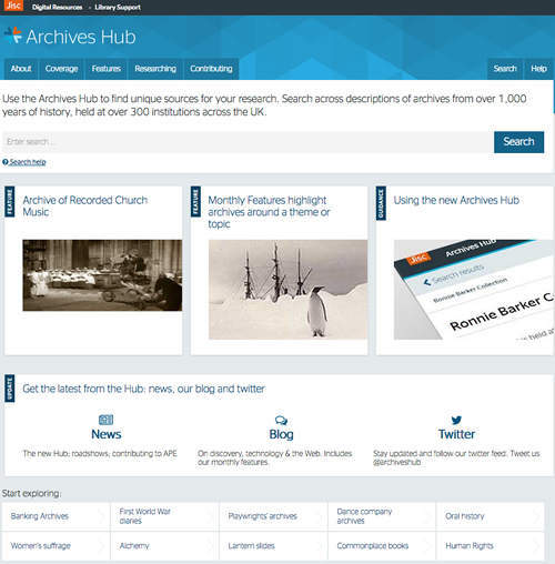
Some of the feedback that we received suggested that the old website design was welcoming, but didn’t feel professional or academic enough – maybe trying to be a bit too cuddly. We still wanted to make the site friendly and engaging, and I think we achieved this, but we also wanted to make it more professional looking, showing the Hub as an academic research tool. It was also important to show that the Archives Hub is a Jisc service, so the design Gooii created was based upon the Jisc pattern library that we were required to use in order to fit in with other Jisc sites.
We have tried to maintain a friendly and informal tone along with use of cleaner lines and blocks, and a more visually up-to-date feel. We have a set of consistent icons, on/off buttons and use of show/hide, particularly with the filter. This helps to keep an uncluttered appearance whilst giving the user many options for navigation and filtering.
In response to feedback, we want to provide more help with navigating through the service, for those that would like some guidance. The homepage includes some ‘start exploring’ suggestions for topics, to help get inexperienced researchers started, and we are currently looking at the whole ‘researching‘ section and how we can improve that to work for all types of users.
Navigating
We wanted the Hub to work well with a fairly broad search that casts the net quite widely. This type of search is often carried out by a user who is less experienced in using archives, or is new to the Hub, and it can produce a rather overwhelming number of results. We have tried to facilitate the onward journey of the user through judicious use of filtering options. In many ways we felt that filtering was more important than advanced search in the website design, as our research has shown that people tend to drill down from a more general starting point rather than carry out a very specific search right from the off. The filter panel is up-front, although it can be hidden/shown as desired, and it allows for drilling down by repository, subject, creator, date, level and digital content.
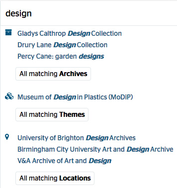
Another way that we have tried to help the end user is by using typeahead to suggest search results. When Gooii suggested this, we gave it some thought, as we were concerned that the user might think the suggestions were the ‘best’ matches, but typeahead suggestions are quite a common device on the web, and we felt that they might give some people a way in, from where they could easily navigate through further descriptions.

The suggestions may help users to understand the sort of collections that are described on the Hub. We know that some users are not really aware of what ‘archives’ means in the context of a service like the Archives Hub, so this may help orientate them.
Suggested results also help to explain what the categories of results are – themes and locations are suggested as well as collection descriptions.
We thought about the usability of the hit list. In the feedback we received there was no clear preference for what users want in a hit list, and so we decided to implement a brief view, which just provides title and date, for maximum number of results, and also an expanded view, with location, name of creator, extent and language, so that the user can get a better idea of the materials being described just from scanning through the hit list.

With the above example, the title and date alone do not give much information, which is particularly common with descriptions of series or items, of so the name of creator adds real value to the result.
Seeing the Wood Through the Trees
The hierarchical nature of archives is always a challenge; a challenge for cataloguing, processing and presentation. In terms of presentation, we were quite excited by the prospect of trying something a bit different with the new Hub design. This is where the ‘mini map’ came about. It was a very early suggestion by K-Int to have something that could help to orientate the user when they suddenly found themselves within a large hierarchical description. Gooii took the idea and created a number of wireframes to illustrate it for our focus groups.
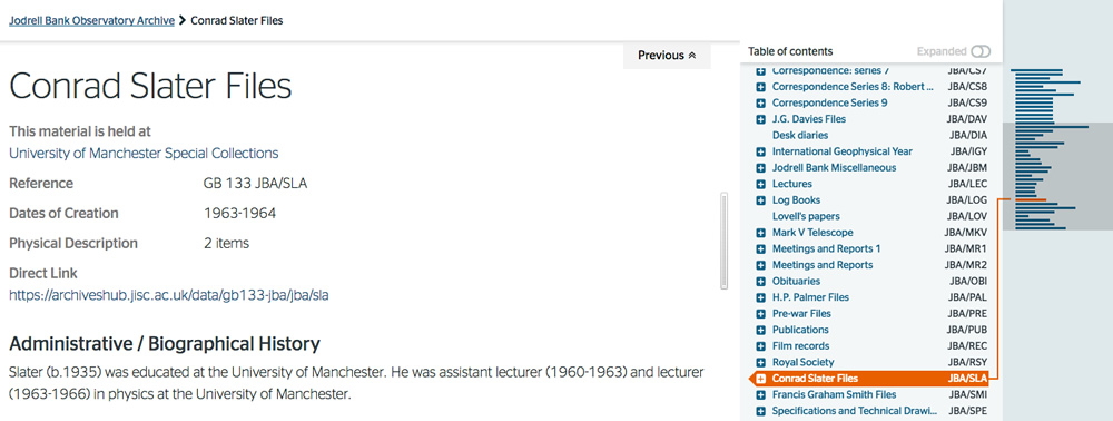
For instance, if a user searches on Google for ‘conrad slater jodrell bank’ then they get a link to the Hub entry:

The user may never have used archives, or the Archives Hub before. But if they click on this link, taking them directly to material that sits within a hierarchical description, we wanted them to get an immediate context.

The page shows the description itself, the breadcrumb to the top level, the place in the tree where these particular files are described and a mini map that gives an instant indication of where this entry is in the whole. It is intended (1) to give a basic message for those who are not familiar with archive collections – ‘there is lots more stuff in this collection’ and (2) to provide the user with a clearly understandable expanding tree for navigation through this collection.
One of the decision we made, illustrated here, was to show where the material is held at every level, for every unit of description. The information is only actually included at the top level in the description itself, but we can easily cascade it down. This is a good illustration of where the approach to displaying archive descriptions needs to be appropriate for the Web – if a user comes straight into a series or item, you need to give context at that level and not just at the top level.
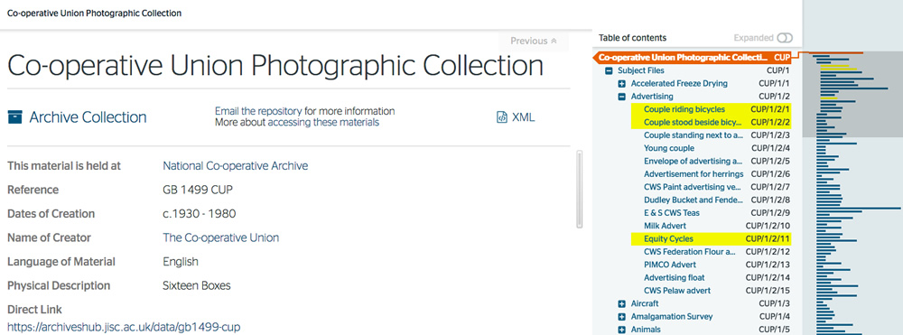
The design also works well for searches within large hierarchical descriptions.

The user can immediately get a sense of whether the search has thrown up substantial results or not. In the example above you can see that there are some references to ‘bicycles’ but only early on in the description. In the example below, the search for ‘frost on sunday’ shows that there are many references within the Ronnie Barker Collection.

One of the challenges for any archive interface is to ensure that it works for experienced users and first-time users. We hope that the way we have implemented navigation and searching mean that we have fulfilled this aim reasonably well.
Small is Beautiful

The old site did not work well on mobile devices. It was created before mobile became massive, and it is quite hard to retrospectively fit a design to be responsive to different devices. Gooii started out with the intention of creating a responsive design, so that it renders well on different sized screens. It requires quite a bit of compromise, because rendering complex multi-level hierarchies and very detailed catalogues on a very small screen is not at all easy. It may be best to change or remove some aspects of functionality in order to ensure the site makes sense. For example, the mobile display does not open the filter by default, as this would push the results down the page. But the user can open the filter and use the faceted search if they choose to do so.
We are particularly pleased that this has been achieved, as something like 30% of Hub use is on mobiles and tablets now, and the basic search and navigation needs to be effective.

In the above graph, the orange line is desktop, the green is mobile and the purple is tablet. (the dip around the end of December is due to problems setting up the Analytics reporting).
Cutting Our Cloth
One of the lessons we have learnt over 15 years of working on the Archives Hub is that you can dream up all of the interface ideas that you like, but in the end what you can implement successfully comes down to the data. We had many suggestions from contributors and researchers about what we could implement, but oftentimes these ideas will not work in practice because of the variations in the descriptions.
We though about implementing a search for larger, medium sized or smaller collections, but you would need consistent ‘extent’ data, and we don’t have that because archivists don’t use any kind of controlled vocabulary for extent, so it is not something we can do.
When we were running focus groups, we talked about searching by level – collection, series, sub-series, file, item, etc. For some contributors a search by a specific level would be useful, but we could only implement three levels – collection (or ‘top level’), item (which includes ‘piece’) and then everything between these, because the ‘in-between’ levels don’t lend themselves to clear categorisation. The way levels work in archival description, and the way they are interpreted by repositories, means we had to take a practical view of what was achievable.
We still aren’t completely sold on how we indicate digital content, but there are particular challenges with this. Digital content can be images that are embedded within the description, links to images, or links to any other digital content imaginable. So, you can’t just use an image icon, because that does not represent text or audio. We ended up simply using a tick to indicate that there is digital content of some sort. However, one large collection may have links to only one or two digital items, so in that case the tick may raise false expectations. But you can hardly say ‘includes digital content, but not very much, so don’t get too excited’. There is room for more thought about our whole approach to digital content on the Hub, as we get more links to digital surrogates and descriptions of born-digital collections.
Statistics
The outward indication of a more successful site is that use goes up. The use of statistics to give an indication of value is fraught with problems. Do the number of clicks represent value? Might more clicks indicate a poorer user interface design? Or might they indicate that users find the site more engaging? Does a user looking at only one description really gain less value than a user looking at ten descriptions? Clearly statistics can only ever be seen as one measure of value, and they need to be used with caution. However, the reality is that an upward graph is always welcomed! Therefore we are pleased to see that overall use of the website is up around 32% compared to this period during the previous year.
 Jan 2016 (the orange line) and Jan 2017 (the blue line), which shows typical daily use above 2,000 page views.
Feedback
We are pleased to say that the site has been very well received…
“The new site is wonderful. I am so impressed with its speed and functionality, as well as its clean, modern look.” (University Archivist)
“…there are so many other features that I could pick out, such as the ability to download XML and the direct link generator for components as well as collections, and the ‘start exploring’ feature.” (University Archivist)
“Brand new Archives Hub looks great. Love how the ‘explorer themes’ connect physically separated collections” (Specialist Repository Head of Collections)
“A phenomenal achievement!” (Twitter follower)
With thanks to Rob Tice from Knowledge Integration for his input to this post.
Save
